Magazine Layout
A double page spread for a surfing magazine
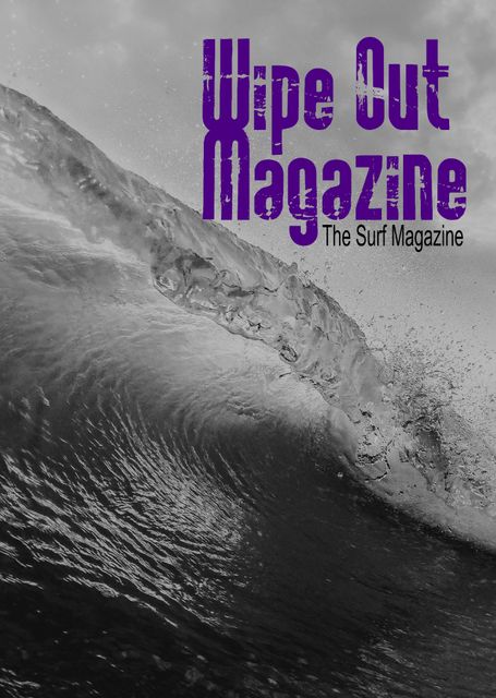
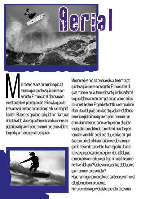
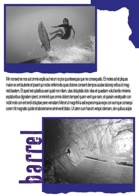
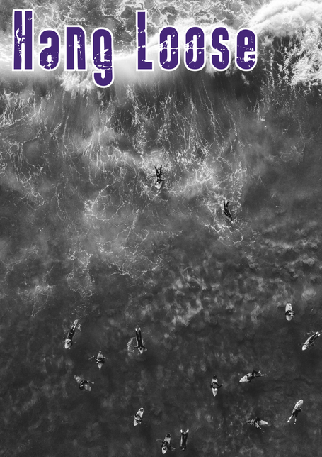
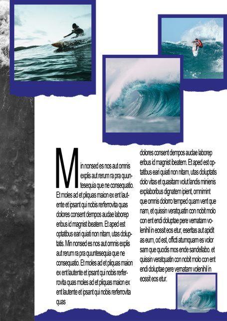
Wipe Out Magazine is one of the leading surf magazines in the world. They are looking for a fresh new look and feel for their magazine. The magazine is packed full of interviews with some of the most reputable and legendary surfers from across the globe, as well as the freshest surf garms, boards and equipment.
To appeal to both the younger and older demographics, they want the design to feel stylish and fashionable, but with an old-school twist. To get an idea of the creative direction, they would like to see a double page magazine spread, with a clear and defined route for the design which they will then plan to roll out across their magazine for 2020 and 2021. They are open-minded to the content you choose to include in the designs, as at this stage the focus is on the aesthetic. The only requirements is it must include action-based images of surfers - so, no images of surfers walking down the beach - and clear defined styles for main titles, sub headers, body text and pull quotes.
Wipe Out Magazine has an adrenaline fuelled brand personality, and they want to convey this feeling in the new design style.
This is a full colour, printed magazine.
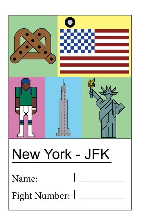
Custom luggage tags
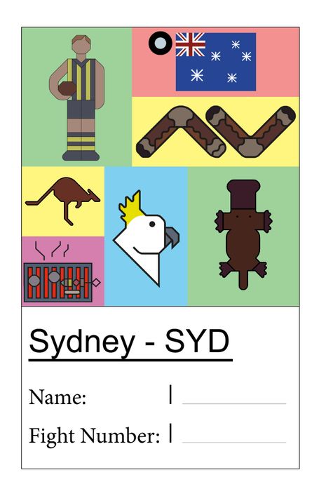
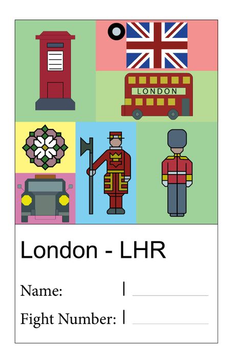
To choose a few destinations that either mean a lot or that had some connection with, and create a collection of custom luggage tags based around these places.
There are a lot of designs of luggage tags, which can start to look quite similar.
I decided to use London, New York and Sydney as places I've visited and mean a lot to me. I used digital, quite geometrical illustrations of thing unique to each destination - the flag of the country, buildings, people or wildlife which help to make my designs unique.
© Copyright. All rights reserved.
We need your consent to load the translations
We use a third-party service to translate the website content that may collect data about your activity. Please review the details and accept the service to view the translations.